
Excel Pivot Tables Mastery: Analyze Data in Minutes
Pivot Tables are Excel's most powerful feature for data analysis. They turn hours of manual work into seconds of insight. This guide teaches you to build, customize, and troubleshoot Pivot Tables with real business scenarios — no theory, just practical patterns you can copy and adapt.
Tip: Follow along with your own data. Most examples work with any dataset that has rows and columns.
1) What Are Pivot Tables? (Quick Context)
A Pivot Table is a summary tool that reorganizes your data. Instead of writing complex formulas, you drag and drop fields to create instant summaries, totals, and comparisons.
Why use Pivot Tables?
- Speed: Analyze thousands of rows in seconds
- Flexibility: Change your view without rewriting formulas
- Accuracy: Less manual calculation = fewer errors
- Visualization: Built-in charts and formatting
When to use them:
- Sales reports by region/product/date
- Expense summaries by category/month
- Employee data by department/role
- Inventory analysis by location/status
- Any dataset where you need to "group by" and summarize
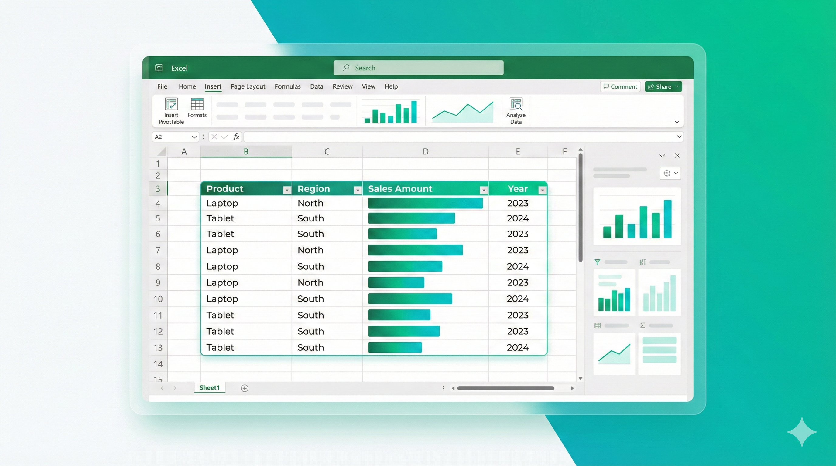
Sample Sales Data for Pivot Tables
This is the raw data you'll use to create Pivot Tables. Notice the structure: Date, Product, Region, and Sales Amount columns.
fxspreadsheet.cellsWithFormulas
spreadsheet.hoverFormulaCells
2) Your First Pivot Table: Sales by Region
🎯 Scenario: You have sales data and need totals by region.
Data Setup:
- Column A: Date
- Column B: Product
- Column C: Region
- Column D: Sales Amount
Step-by-Step:
- Select your data (including headers): Click any cell in your data, press
Ctrl+A - Insert Pivot Table:
- Go to Insert → PivotTable (or press
Alt+N+V) - Excel auto-detects your range
- Choose "New Worksheet" (recommended for first time)
- Click OK
- Go to Insert → PivotTable (or press
- Build the Pivot Table:
- Drag Region to Rows
- Drag Sales Amount to Values
- Excel automatically sums the amounts
Result: You now see total sales for each region.
Pitfall: If your data has blank rows or columns, Excel might select the wrong range. Always check the range in the dialog, or convert your data to an Excel Table first (
Ctrl+T).
Mini exercise: Create a Pivot Table showing total sales by Product instead of Region.
3) Multiple Fields: Region + Product Analysis
🎯 Scenario: You need sales by both region AND product.
Setup:
- Drag Region to Rows
- Drag Product to Rows (below Region)
- Drag Sales Amount to Values
Result: You see a hierarchical view:
- North
- Laptop: $50,000
- Tablet: $30,000
- South
- Laptop: $45,000
- Tablet: $25,000
Pro tip: The order matters. If you drag Product first, then Region, you'll see products at the top level. Drag fields up/down in the Rows area to reorder.
Change the layout:
- Right-click the Pivot Table → PivotTable Options → Display tab
- Choose "Tabular Form" for a flatter layout (each row/column combination gets its own row)
4) Columns: Time-Based Analysis
🎯 Scenario: Sales by region (rows) and month (columns).
Setup:
- Drag Region to Rows
- Drag Date to Columns (Excel groups by month automatically)
- Drag Sales Amount to Values
Result: A matrix showing region totals across months.
Group dates manually:
- Right-click any date in the Pivot Table
- Choose Group
- Select Months, Quarters, or Years
- Click OK
Pitfall: If dates are stored as text, grouping won't work. Convert them to real dates first (see our "Cleaning Messy Data" blog).
Mini exercise: Group dates by quarters and add a grand total column.
5) Filters: Focus on Specific Data
🎯 Scenario: Show sales by region, but only for "Laptop" products.
Setup:
- Drag Product to Filters (top of Pivot Table)
- Drag Region to Rows
- Drag Sales Amount to Values
- Use the dropdown at the top to select "Laptop"
Result: Only laptop sales by region.
Multiple filters:
- Add Date to Filters as well
- Use both dropdowns to narrow your view
Pro tip: Filters affect the entire Pivot Table. If you need different views, create separate Pivot Tables or use Slicers (covered later).
6) Value Calculations: Sum, Average, Count
By default, Pivot Tables sum numeric fields. Change the calculation:
Right-click any value → Value Field Settings → Choose:
- Sum: Total (default for numbers)
- Average: Mean value
- Count: Number of records
- Max/Min: Highest/lowest value
- Count Numbers: Counts only numeric cells (ignores text)
🎯 Scenario: Average sales per transaction by region.
Setup:
- Drag Region to Rows
- Drag Sales Amount to Values
- Right-click the sum → Value Field Settings → Average
- Click OK
Show multiple calculations:
- Drag Sales Amount to Values again
- Change one to Sum, one to Average
- Rename them (right-click → Value Field Settings → Custom Name)
Result: You see both total and average sales side by side.
7) Calculated Fields: Custom Metrics
🎯 Scenario: Calculate profit margin (Profit / Sales) in the Pivot Table.
Setup:
- Click anywhere in the Pivot Table
- Go to PivotTable Analyze → Fields, Items & Sets → Calculated Field
- Name: "Profit Margin"
- Formula:
=Profit/Sales(use field names from the list, not cell references) - Click Add → OK
Result: A new column showing profit margin for each group.
Common calculated fields:
- Growth Rate:
=(Current - Previous) / Previous - Percentage of Total:
=Sales / TotalSales(use "Show Values As" instead — see next section) - Unit Price:
=Revenue / Quantity
Pitfall: Calculated fields use the sum of each field, not individual row values. For row-level calculations, add a helper column to your source data instead.
8) Show Values As: Percentages and Running Totals
🎯 Scenario: Show each region's sales as a percentage of the grand total.
Setup:
- Right-click any value → Show Values As → % of Grand Total
Other useful options:
- % of Row Total: Percentage within each row group
- % of Column Total: Percentage within each column group
- Running Total: Cumulative sum over time
- Difference From: Compare to previous period or specific item
Example: Month-over-month growth:
- Drag Date to Rows (grouped by month)
- Drag Sales Amount to Values
- Right-click values → Show Values As → Difference From
- Base field: Date, Base item: Previous
Result: Shows the change from the previous month.
9) Slicers: Interactive Filtering (Excel 2010+)
Slicers are visual filters that make Pivot Tables interactive and user-friendly.
🎯 Scenario: Create a dashboard where users can filter by region and product with buttons.
Setup:
- Click anywhere in the Pivot Table
- Go to PivotTable Analyze → Insert Slicer
- Select Region and Product (or any fields you want to filter)
- Click OK
Result: Buttons appear that filter the Pivot Table when clicked.
Format slicers:
- Right-click a slicer → Slicer Settings
- Choose "Hide items with no data" to clean up the view
- Use Slicer Tools → Options to change colors and styles
Connect multiple Pivot Tables:
- Right-click a slicer → Report Connections
- Check all Pivot Tables you want to control
- One slicer now filters multiple tables
Pro tip: Create a dashboard sheet with Pivot Tables and Slicers. Users can explore data without touching the source.
10) Timelines: Date Range Filtering (Excel 2013+)
Timelines are specialized slicers for dates.
Setup:
- Click the Pivot Table
- Go to PivotTable Analyze → Insert Timeline
- Select your date field
- Click OK
Result: A visual date range selector (months, quarters, or years).
Use cases:
- Financial dashboards with year-over-year comparisons
- Sales reports with rolling date windows
- Project tracking with milestone filters
11) Pivot Charts: Visualize Your Data
Turn Pivot Tables into charts instantly.
Setup:
- Click anywhere in the Pivot Table
- Go to PivotTable Analyze → PivotChart
- Choose chart type (Column, Line, Pie, etc.)
- Click OK
Result: A chart that updates when you change the Pivot Table.
Pro tips:
- Use PivotChart Tools → Design to change styles
- Right-click chart → Select Data to adjust what's shown
- Charts automatically reflect slicer filters
Mini exercise: Create a Pivot Table of sales by month, then add a line chart showing the trend.
12) Refreshing Data: Keep Pivot Tables Current
When source data changes, Pivot Tables don't update automatically.
Manual refresh:
- Right-click the Pivot Table → Refresh
- Or press
Alt+F5 - Or go to PivotTable Analyze → Refresh
Auto-refresh on open:
- Right-click Pivot Table → PivotTable Options → Data tab
- Check "Refresh data when opening the file"
Refresh all Pivot Tables:
- Go to Data → Refresh All (or
Ctrl+Alt+F5)
Pitfall: If you add new rows to your source data, the Pivot Table range might not include them. Convert source data to an Excel Table (
Ctrl+T) — Pivot Tables based on Tables automatically expand.
13) Common Mistakes and How to Fix Them
Mistake 1: "We couldn't get the data"
Problem: Source data range is incorrect or has issues.
Solution:
- Check the source range: Right-click Pivot Table → PivotTable Options → Data tab → Check "Source"
- Ensure no blank rows/columns in the middle of data
- Convert to Excel Table (
Ctrl+T) for dynamic ranges
Mistake 2: Numbers showing as text
Problem: Source data has numbers stored as text.
Solution:
- Fix source data first (use
VALUE()or clean imports) - Or right-click Pivot Table → Refresh after fixing source
Mistake 3: Dates not grouping
Problem: Dates are text, not real date values.
Solution:
- Convert source dates to real dates (see "Cleaning Messy Data" blog)
- Refresh Pivot Table
Mistake 4: Duplicate values in rows
Problem: Source data has duplicates you didn't account for.
Solution:
- This is often correct (e.g., multiple sales of same product)
- If unwanted, clean source data or add more grouping fields
Mistake 5: Can't change calculation type
Problem: Field contains text or mixed data types.
Solution:
- Ensure the field is numeric in source data
- Use "Count Numbers" if you only want to count numeric cells
14) Real-World Scenarios
Scenario 1: Sales Dashboard
Goal: Monthly sales by region and product with year-over-year comparison.
Setup:
- Rows: Region, Product
- Columns: Date (grouped by month)
- Values: Sales Amount (Sum), Sales Amount (Show as % of previous year)
- Filters: Year (to compare specific years)
- Slicers: Region, Product (for quick filtering)
Scenario 2: HR Headcount Report
Goal: Employee count by department and role, with hire/exit trends.
Setup:
- Rows: Department, Role
- Values: Employee ID (Count)
- Calculated Field: "Attrition Rate" =
Exits / (Hires + Current) - Timeline: Hire Date (to see trends over time)
Scenario 3: Expense Analysis
Goal: Monthly expenses by category with budget comparison.
Setup:
- Rows: Category
- Columns: Date (grouped by month)
- Values: Amount (Sum)
- Add budget data as a separate field
- Calculated Field: "Variance" =
Actual - Budget - Conditional formatting to highlight over-budget items
15) Advanced Tips
Tip 1: Use Excel Tables as Source
Convert source data to an Excel Table (Ctrl+T):
- Pivot Tables automatically include new rows
- Named ranges make formulas easier
- Consistent formatting
Tip 2: Multiple Value Fields
Drag the same field to Values multiple times:
- Change each to a different calculation (Sum, Average, Count)
- Rename them for clarity
- Create comprehensive summaries in one Pivot Table
Tip 3: Custom Sort Orders
Right-click any row label → Sort → More Sort Options:
- Choose "Manual" to drag items into custom order
- Or sort by values (e.g., show highest sales regions first)
Tip 4: Format Numbers
Right-click values → Number Format:
- Choose currency, percentage, or custom formats
- Applies to all values in that field
Tip 5: Preserve Formatting
Right-click Pivot Table → PivotTable Options → Layout & Format:
- Check "Preserve cell formatting on update"
- Your manual formatting won't disappear on refresh
16) Mini Exercises
-
Basic Pivot: Create a Pivot Table showing total sales by product. Add a second calculation showing average sales per transaction.
-
Multi-level: Build a Pivot Table with Region in rows, Product as a sub-row, and Date (by month) in columns.
-
Calculated Field: Add a "Profit Margin" calculated field that divides Profit by Sales.
-
Slicers: Create a Pivot Table with Slicers for Region and Product. Test filtering with different combinations.
-
Show Values As: Change a sales Pivot Table to show each product as a percentage of the grand total.
-
Timeline: Add a Timeline to a date-based Pivot Table and filter to show only the last 3 months.
Quick Checklist
Before creating a Pivot Table:
- Is my source data clean? (no blank rows/columns in the middle)
- Are dates real dates, not text?
- Are numbers actually numeric, not text?
- Do I have headers in the first row?
- Should I convert to an Excel Table first? (
Ctrl+T)
After creating:
- Did I choose the right calculation (Sum, Average, Count)?
- Are my field names clear?
- Should I add Slicers for easier filtering?
- Do I need a Pivot Chart for visualization?
- Will I need to refresh this data regularly?
Conclusion
Pivot Tables transform Excel from a calculator into an analysis tool. Start with simple summaries, add filters and calculations as needed, and use Slicers to make your reports interactive.
The key is practice: build Pivot Tables with your own data, experiment with different layouts, and don't be afraid to delete and rebuild. Each Pivot Table you create makes the next one faster.
Remember: Pivot Tables are meant to be changed. Drag fields around, try different calculations, and explore your data. The undo button (Ctrl+Z) is your friend.
If you want hands-on practice with Excel formulas and Pivot Tables, try the exercises in the app — they're designed to reinforce both formula knowledge and data analysis skills.